Portabello Restaurant and Bar on South Parade in Oxford's Summertown.
We were asked to assist with refurbishing this extremely popular premises, working with the owner to develop his aesthetic vision for the transformation, we provided design advice and working solutions throughout the process. The turnaround refit was 12 days in total which was achieved for a re-launch just before Christmas.
The general concept was to marry elements of Victorian charm and contemporary Soho house chic to give a warm, harmonised functional and aesthetic space, close, expansive, crisp and bright, and create a space to reflect their reputation for quality, providing a fitting backdrop for their renowned menu.
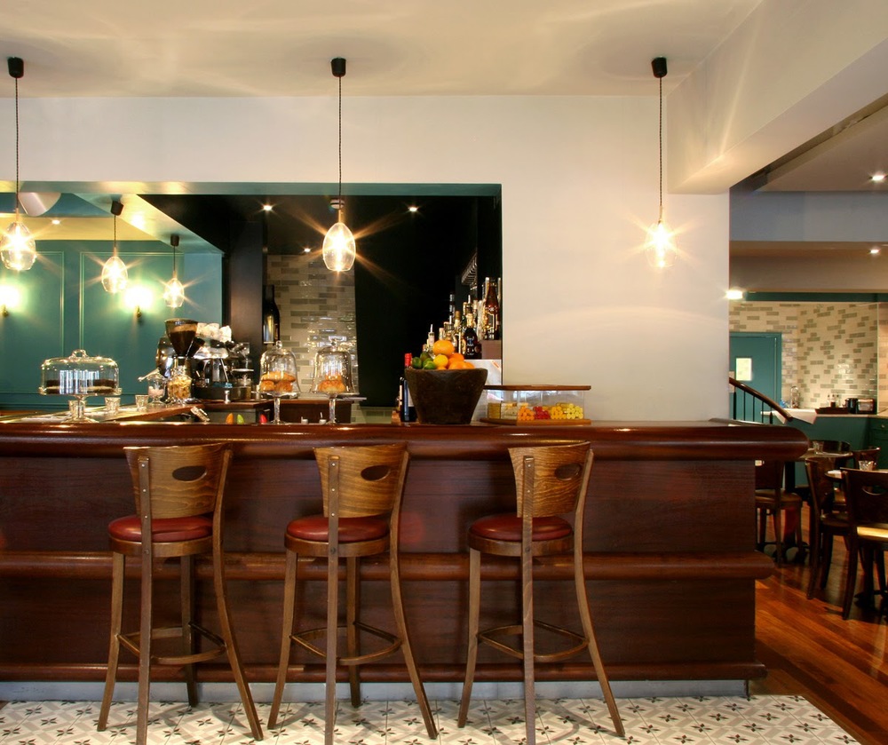

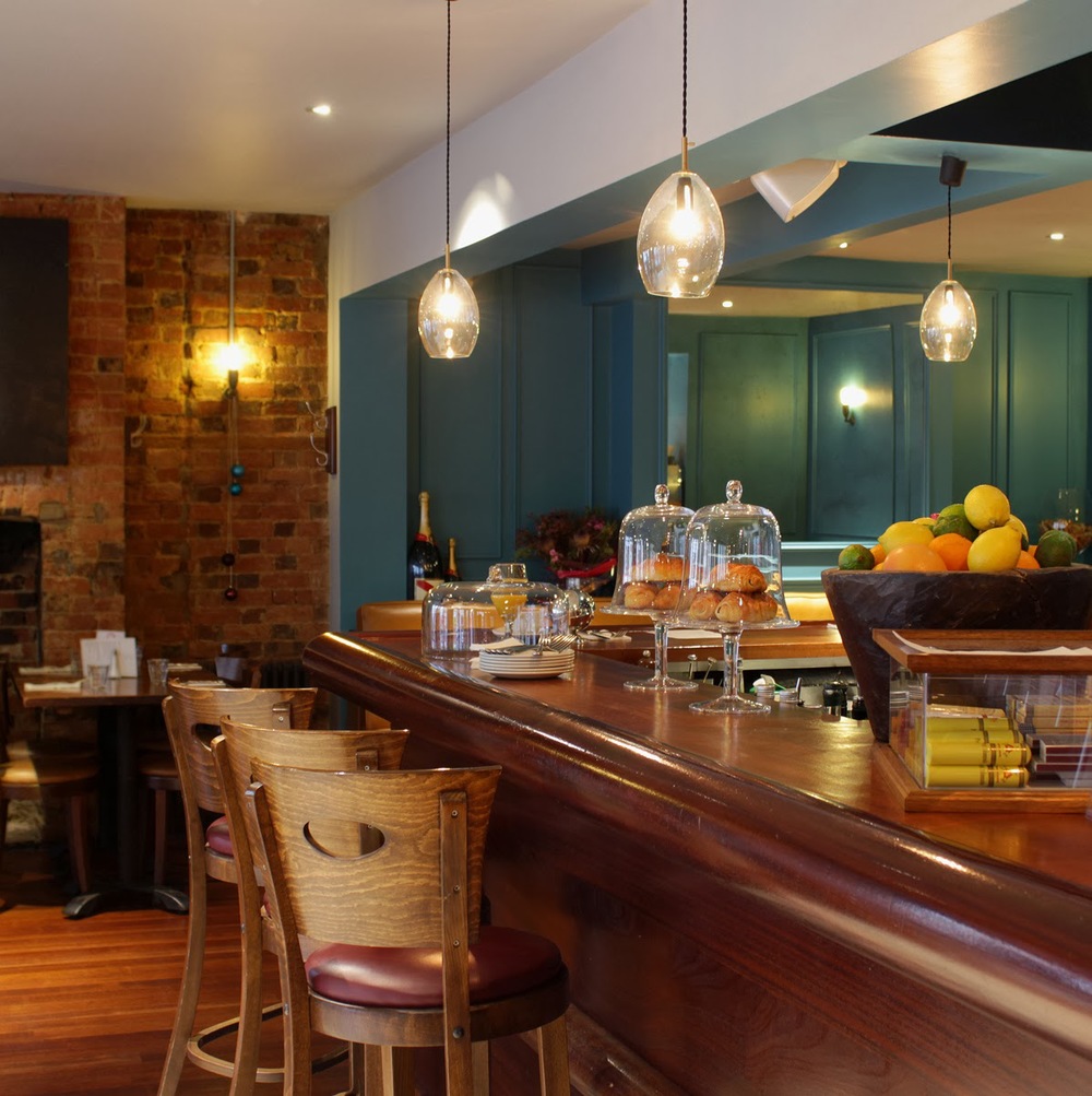
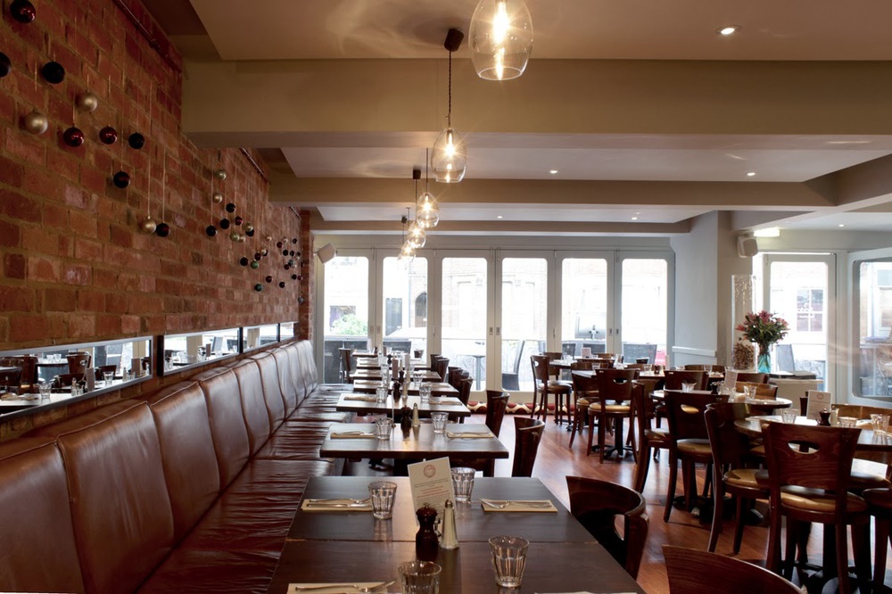
Particular attention was drawn to the need for less intrusive lighting whilst promoting a real sparkle. Ceiling spotlights were inset to help reduce glare and all lighting was placed on dimmers. The pendent lighting which we used as a subtle signature piece we dotted around the bar and over the seating to the right of the bar are from Northern lighting based in Sweden.
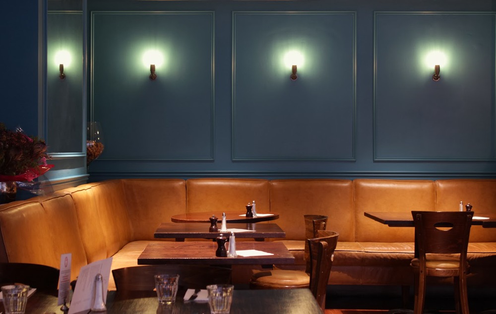
Beautiful cast bronze wall lights with an innovative cold cathode Carat squirrel cage bulbs (a breakthrough invention as alternative to the traditional energy inefficient incandescent version) are by renowned Belgian lighting company Tekna.
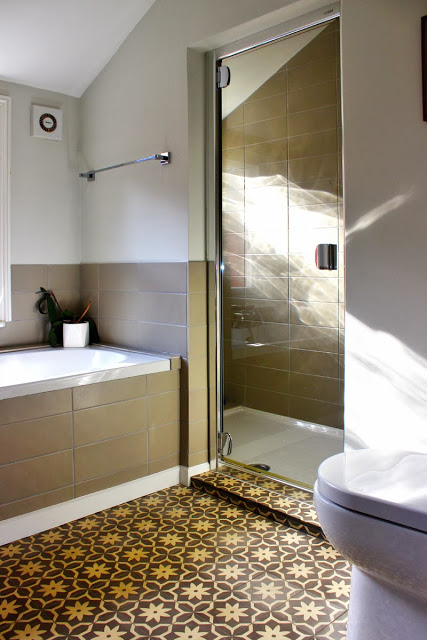
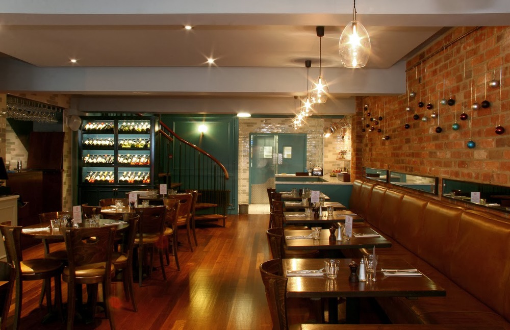
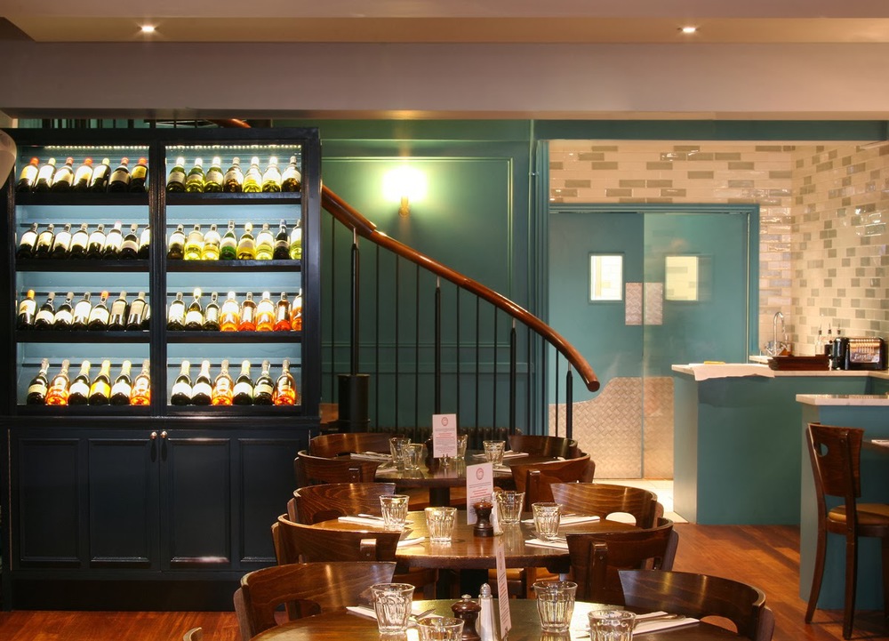
The entrance welcomes with its victorian patterned tiles which make an immediate statement - creates a greater sense of space and has attitude. At the entrance we also included lots of antique mirror work vertical and horizontal with borders of moulding, and moulded panel work used repeatedly throughout to add texture and a version of gentleman's club warmth. This can be seen quite clearly in the inky green snug area to the left of the bar.
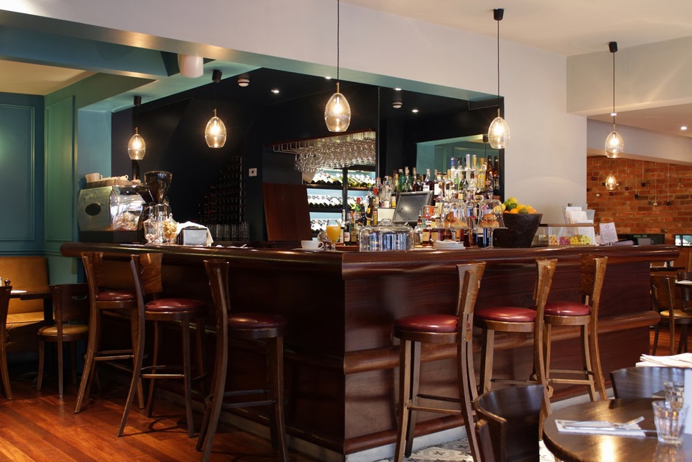 As the space when you enter seems to divide into halves we intentionally made the decision to work with some of the through bar views and using mirror where necessary to give reflection of other spaces and angles that gives a better and useful sense of wholeness.
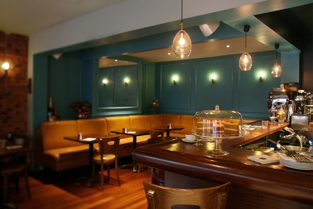
 The tanned, distressed leather banquet seating was existing and became a strong
player in the colour dynamics of the space. The rich blue green holds its own and relates the strong victorian aesthetic element perfectly.
The tanned, distressed leather banquet seating was existing and became a strong
player in the colour dynamics of the space. The rich blue green holds its own and relates the strong victorian aesthetic element perfectly.


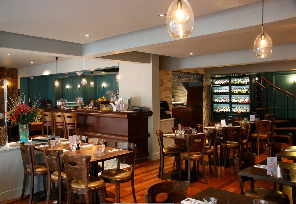
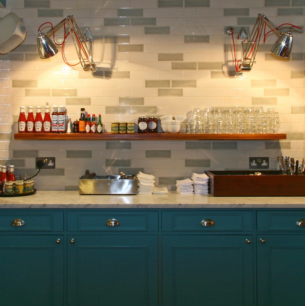
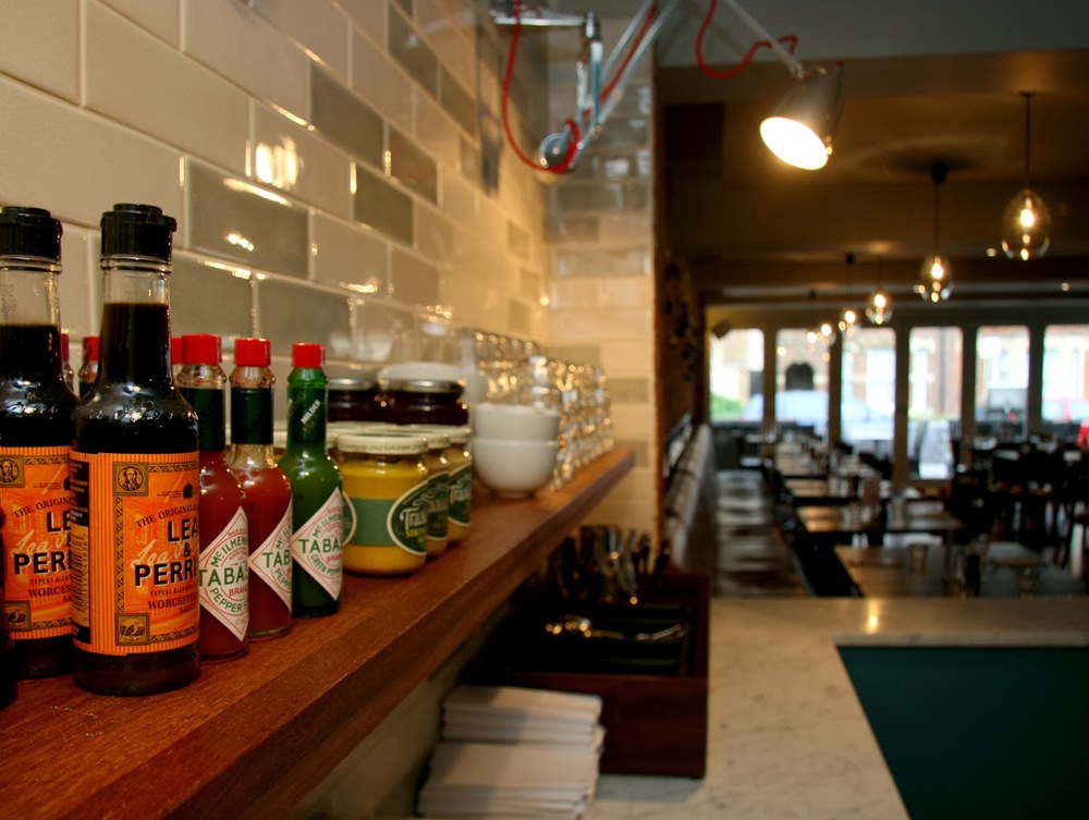
 A waiter and serving station was created in panelled woodwork with Carrara marble, which made the link between guest and food deliberately close. Clean white marble tops and a mosaiced pattern slip glazed metro tiles to the wall, add a playful charm. They also highlight the scale of the room, bringing the front and rear into view at the same time and giving each of these spaces equal status.


We were asked to assist with refurbishing this extremely popular premises, working with the owner to develop his aesthetic vision for the transformation, we provided design advice and working solutions throughout the process. The turnaround refit was 12 days in total which was achieved for a re-launch just before Christmas.
The general concept was to marry elements of Victorian charm and contemporary Soho house chic to give a warm, harmonised functional and aesthetic space, close, expansive, crisp and bright, and create a space to reflect their reputation for quality, providing a fitting backdrop for their renowned menu.
Particular attention was drawn to the need for less intrusive lighting whilst promoting a real sparkle. Ceiling spotlights were inset to help reduce glare and all lighting was placed on dimmers. The pendent lighting which we used as a subtle signature piece we dotted around the bar and over the seating to the right of the bar are from Northern lighting based in Sweden.
Beautiful cast bronze wall lights with an innovative cold cathode Carat squirrel cage bulbs (a breakthrough invention as alternative to the traditional energy inefficient incandescent version) are by renowned Belgian lighting company Tekna.
The entrance welcomes with its victorian patterned tiles which make an immediate statement - creates a greater sense of space and has attitude. At the entrance we also included lots of antique mirror work vertical and horizontal with borders of moulding, and moulded panel work used repeatedly throughout to add texture and a version of gentleman's club warmth. This can be seen quite clearly in the inky green snug area to the left of the bar.
As the space when you enter seems to divide into halves we intentionally made the decision to work with some of the through bar views and using mirror where necessary to give reflection of other spaces and angles that gives a better and useful sense of wholeness. The tanned, distressed leather banquet seating was existing and became a strong
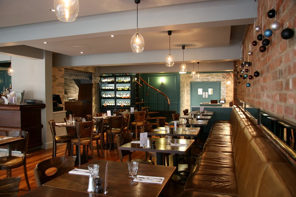
The beautiful blown glass pendents travel down the line of the banquet seating. Close to the bar we designed and produced a wine storage/display cabinet painted in a very dark blue with integrated LED lighting that highlights the space with a level of sweet shop visual treat.
This project was an absolutely pleasure to work on, and has been a hit - with even the restaurant's most loyal regulars. For more details about Portabello, visit their website here