Victorian House:
features: Lacanche gas oven, Island unit, slate grey porcelain tiles, lime green, oak lantern, Blanco inset sink.

This project was the second of 3 commissions by our client, after working with them on the design of
, and then later their
.
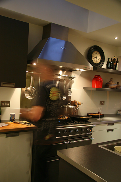
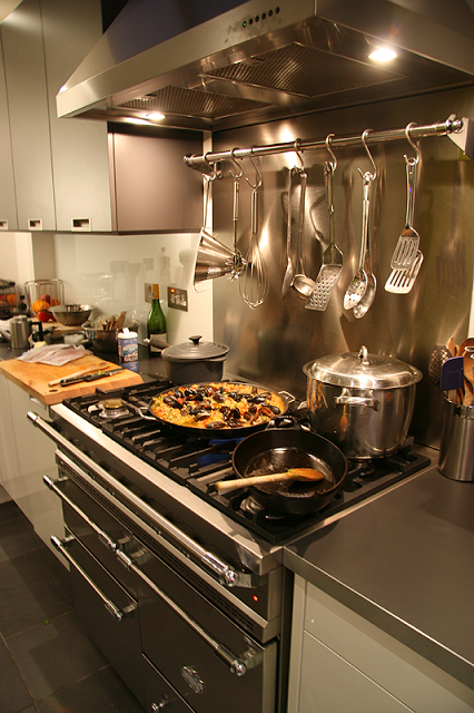
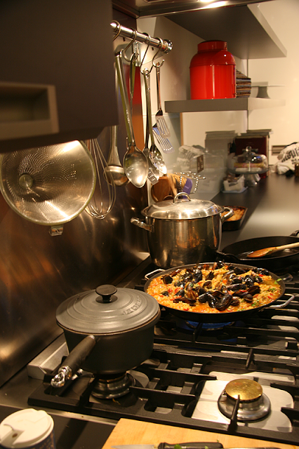
This began life pre-extension and the remit was to design a kitchen that was highly functional and host various items like a large and rather special
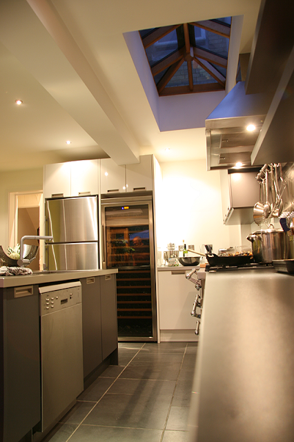
wine fridge (see photo) and also a smaller wine unit to be housed in the island unit. The list of appliances continued; there was the
range; a multi ring gas burner that was to stand centre stage in the kitchen. The owner being a very interested and extremely capable chef insisted upon this furniture, and why not! The extension was cleverly designed by architect
, making much of a slightly awkward space. The extension was carried out to a very good standard and so made the process of designing for the space much easier than it could have been. It is imperative that your builder is accommodating at this stage as various items will impact on the final design. Whilst some features had to be altered i.e.size of steel beams holding up the house, most of the structure and size was kept within targets. Working with an experienced design team at In House, we organised a design that fitted the needs of the client and made sense of the space: ample room for cooking, room for art on walls and a place where this family could be seated in an evening or entertain.

Kitchens are notoriously difficult to organise and generally work around very clear principles. However, every space is different and can ask different questions of the designer.
While its recommended that one should have a good understanding of the principles of kitchen design, commonsense and awareness of the practicalities of usage and the dynamics there in, are essential.
In the photo > Cabinet work is in a mixture of Anthracite and white gloss both with doors that have matching edge details.
Inset handles on the cabinetry avoid fuss and visually speak more discreetly about a design. They also fair a little better chronographically and tend never to lose that much in style.
Set within the anthracite top of the island unit is the Blanco
'zerox' inset sink, with one large sink and a small drainer. Its a 1000mm x 510 unit and has a low profile that keeps the sharp quality to the design.


The incredibly hard wearing floor tiles are ceramic
and the pattern that ensued clearly adds to and makes sense of the linearity of the space.
The lengths of floating shelving, 50mm thick and 350mm wide, were manufactured from the same material as the worktop, also in anthracite and so complimented the rest of the units. Their fixing method is concealed. With the projected weight it was considered that allowances should be made during the building process to accommodate it: as a result, medium density building blocks were used rather than thermalite blocks at the fixing points, in order to secure them.

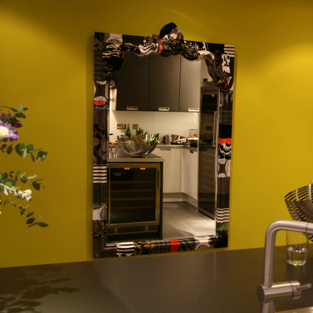
On the feature wall the client commissioned a mirror which was covered rather ornately in mixed elements of fabric from
designs and it sits upon the green wall very effectively. Other elements of interest are got through the individual elements that our client brings to the room such the stainless steel vegetable holder which rests upon the island unit like a floating piece of sculpture.

The colour on the wall is very striking and was chosen by Charlotte. Strong accent colour like this can be quite hard to work with, but we both felt there was a great deal of spirit and good health about this colour and to use it in the scheme would be very affirming. In fact, later on you will see that the colour is repeated in the
. To see this room of an evening, have a look at the
post, which shows off how joyful and colourful even such a vividly minimal and practical kitchen can be.
Striking, clean, highly functional and full of fun.