project: living area, kitchen, extension
features: reclaimed antique parquet muhuhu flooring, Silestone worktop, induction hob, wine storage
 This basement conversion and extension was a huge project, and a fantastic space. A lot of work was carried out to turn what was a dark, and slightly dank basement area into a family space that is extremely habitable and stylish, and given its situation, filled with light. We tackled the project in stages, firstly creating a cosy living and play area in the bay window space at the front along with a central kitchen, and then a pause before the major building project of a light and airy new extension as a dining area, which leads out onto a same level outdoor living space.
When we began, red 'quarry style' tiles sat on the floor, a dark blue 'county style' kitchen blocked off the far end of the room which has now been opened up to the new extension, replacing a rather leaky conservatory type space. The chimney at the living end had also been blocked up previously and the damp that was inside the chimney was interfering with the skirting. All of this was opened up and the rubble removed. We reclaimed the space in the chimney as a display point with a huge oak lintel, and vented it to keep the chimney aerated. The floor was a different story; all the tiles were removed and fortunately, we did get back to a layer of concrete on top of which was laid a breathable membrane. The floor was then put down on a substrate. After much time fitting and sanding the reclaimed parquet the effect was complete - it appeared as if it had been down for the past 120 years or so. A lot of work and time went into the floor but the results are remarkable.
Choosing something that has been used before, despite the clean up process, still means that you are quite likely to get an amount of character running through the floor which can be lacking in pristine wooden floors. we also loved the 'eco' quality of a reclaimed floor, and its history was in keeping with the character of the house. The parquet block floor started life as we knew it in individual blanks bundled into yard squares, and stored in a warehouse in Bath (Walcott reclamation) who deal with architectural antiques. In its previous incarnation it was a school gym floor. It is a wonderful material - dense and fragrant and full of character. Every individual block was processed to be the right depth, this involved stripping off the tar from the bottom using an electric planer. The resulting floor shows incredible personality.
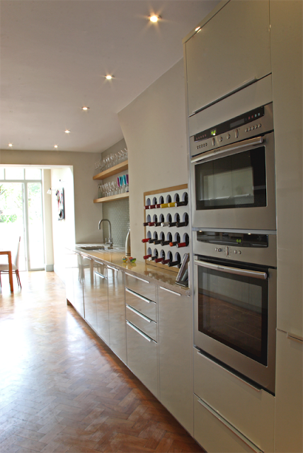
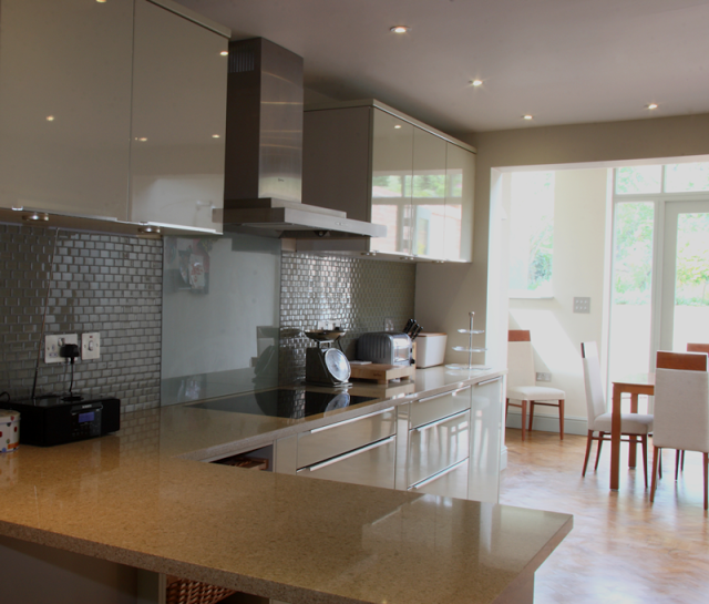
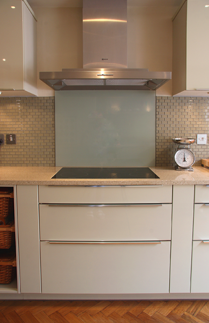
We specified and designed a German made kitchen which was supplied by a local company. We wanted all the surfaces to reflect as much light as possible, and chose a high gloss finish in a beautifully light olive green. A breakfast bar was added to the scheme which doubled as a useful preparation area and keeps the space sociable. The wrap around top is Silestone, a quartz based composite stone which has anti-bacterial properties and is incredibly hardwearing and anti corrosion resistant. Within the L shaped configuration above a miele inset induction hob was set. The owners approached induction cooking after much discussion with some trepidation, but have cherished it ever since. The hob is set into its the top and colour matched intumescent mastik was used to seal it into place. Behind the miele induction hob a hardened glass splashback was fitted, and flat plate sockets (low profile) in stainless steel sit neatly against glass tiles and add further detail.
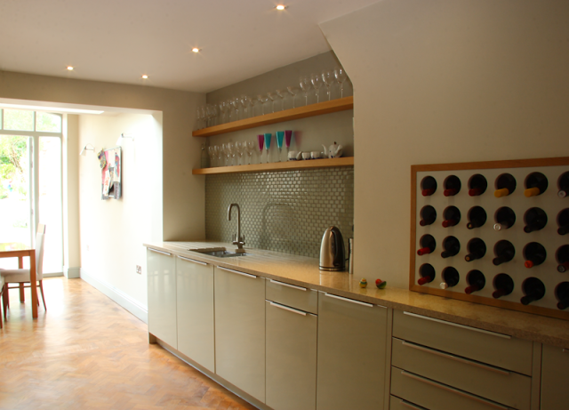
The wine carrier set into the second chimney stack neatly fills a problem space or 'hole' that the owner wanted us to address. The inventive storage is a modification of a design from another recent project where we reclaimed a disused dumb waiter to house the owners wine collection. The oak frame makes the item stand alone and announce its presence.
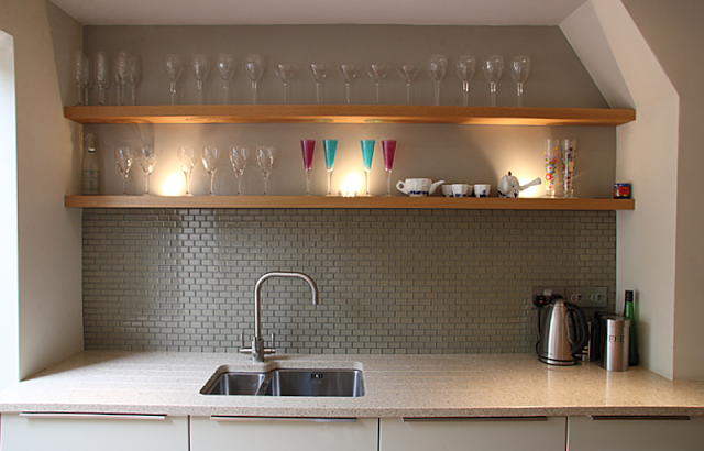
Above the undermount sink, the space was kept incredibly simple and uncluttered; a couple of solid oak shelves run the width of the recess. These have inset uplighters in them that cast a light up through the glassware that the owner is collecting. Glass brick shaped tiles behind the stainless steel tap act as the splashback and also help to reflect some light. The franke tap is quite cool too, as it also has a built in water filter.
During the kitchen conversion what was then the back wall was knocked out and steels were put in to accommodate what would become an extension in phase 6. Planning for the extension didn't present too much difficulty, but consideration was applied to where the flooring would end and how it could follow on at exactly the same height. We were also conscious of where the kitchen units would end and how they would interact with the new space. We decided to dress the flooring right up to a false wall that was created for the interim period (on the back of the house) so the extension would be seamless. see Victorian house: extension.
features: reclaimed antique parquet muhuhu flooring, Silestone worktop, induction hob, wine storage
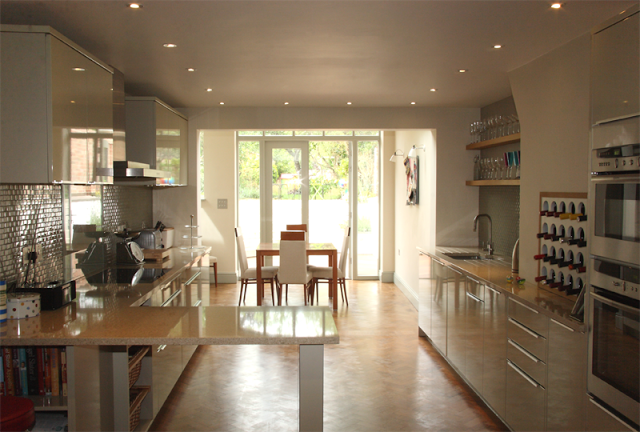 |
| the kitchen with view to dining room extension (phase 6) |
 This basement conversion and extension was a huge project, and a fantastic space. A lot of work was carried out to turn what was a dark, and slightly dank basement area into a family space that is extremely habitable and stylish, and given its situation, filled with light. We tackled the project in stages, firstly creating a cosy living and play area in the bay window space at the front along with a central kitchen, and then a pause before the major building project of a light and airy new extension as a dining area, which leads out onto a same level outdoor living space.
 When we began, red 'quarry style' tiles sat on the floor, a dark blue 'county style' kitchen blocked off the far end of the room which has now been opened up to the new extension, replacing a rather leaky conservatory type space. The chimney at the living end had also been blocked up previously and the damp that was inside the chimney was interfering with the skirting. All of this was opened up and the rubble removed. We reclaimed the space in the chimney as a display point with a huge oak lintel, and vented it to keep the chimney aerated. The floor was a different story; all the tiles were removed and fortunately, we did get back to a layer of concrete on top of which was laid a breathable membrane. The floor was then put down on a substrate. After much time fitting and sanding the reclaimed parquet the effect was complete - it appeared as if it had been down for the past 120 years or so. A lot of work and time went into the floor but the results are remarkable.
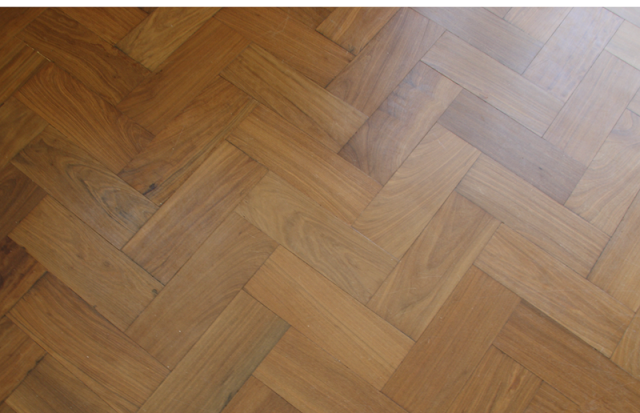 |
| parquet flooring in herringbone configuration |
Choosing something that has been used before, despite the clean up process, still means that you are quite likely to get an amount of character running through the floor which can be lacking in pristine wooden floors. we also loved the 'eco' quality of a reclaimed floor, and its history was in keeping with the character of the house. The parquet block floor started life as we knew it in individual blanks bundled into yard squares, and stored in a warehouse in Bath (Walcott reclamation) who deal with architectural antiques. In its previous incarnation it was a school gym floor. It is a wonderful material - dense and fragrant and full of character. Every individual block was processed to be the right depth, this involved stripping off the tar from the bottom using an electric planer. The resulting floor shows incredible personality.
We specified and designed a German made kitchen which was supplied by a local company. We wanted all the surfaces to reflect as much light as possible, and chose a high gloss finish in a beautifully light olive green. A breakfast bar was added to the scheme which doubled as a useful preparation area and keeps the space sociable. The wrap around top is Silestone, a quartz based composite stone which has anti-bacterial properties and is incredibly hardwearing and anti corrosion resistant. Within the L shaped configuration above a miele inset induction hob was set. The owners approached induction cooking after much discussion with some trepidation, but have cherished it ever since. The hob is set into its the top and colour matched intumescent mastik was used to seal it into place. Behind the miele induction hob a hardened glass splashback was fitted, and flat plate sockets (low profile) in stainless steel sit neatly against glass tiles and add further detail.

The wine carrier set into the second chimney stack neatly fills a problem space or 'hole' that the owner wanted us to address. The inventive storage is a modification of a design from another recent project where we reclaimed a disused dumb waiter to house the owners wine collection. The oak frame makes the item stand alone and announce its presence.
Above the undermount sink, the space was kept incredibly simple and uncluttered; a couple of solid oak shelves run the width of the recess. These have inset uplighters in them that cast a light up through the glassware that the owner is collecting. Glass brick shaped tiles behind the stainless steel tap act as the splashback and also help to reflect some light. The franke tap is quite cool too, as it also has a built in water filter.
During the kitchen conversion what was then the back wall was knocked out and steels were put in to accommodate what would become an extension in phase 6. Planning for the extension didn't present too much difficulty, but consideration was applied to where the flooring would end and how it could follow on at exactly the same height. We were also conscious of where the kitchen units would end and how they would interact with the new space. We decided to dress the flooring right up to a false wall that was created for the interim period (on the back of the house) so the extension would be seamless. see Victorian house: extension.
We used the pale olive and lichen colour scheme as a modern twist on the classic 'farrow and ball' kind of lichen, the intension was to keep the space light with colours that follow through from the rest of the house, and are classic and timeless palette.

