living etc front cover rogue-designs
This particular project features on our main web site. However I thought I would share more photos with you. The project itself featured in Living etc magazine (front cover no less) and also featured as one of their 50 best for that year.
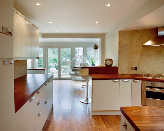
The whole of the interior was knocked through and opened up to maximise the level of light penetration from the back of the house.
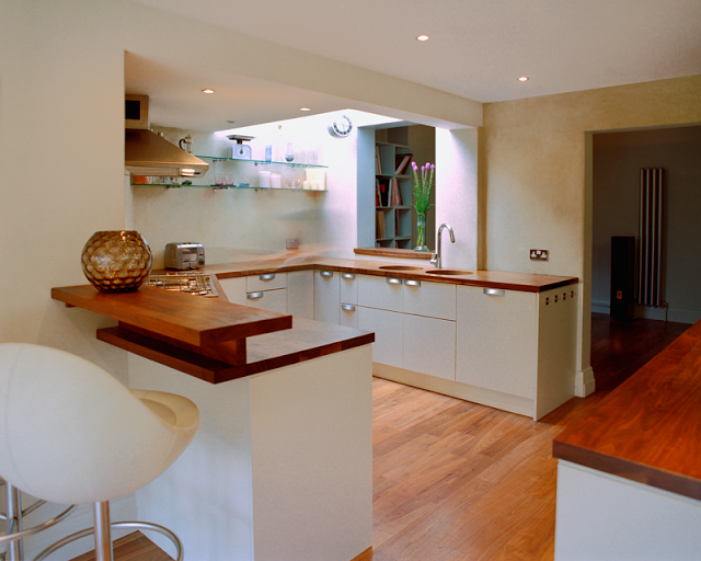
The kitchen boasted 40mm walnut worktops that wrapped around 3 sides and at the end had a small breakfast bar area. Along the main wall through to the dining space there was another bank of units that carried a greater amount of space for food storage and prep. The inset sinks add to the designs less cluttered aspect. Walnut insets were created to sit over the sink when not in use.
The walls were very exciting and somewhat experimental. They are of a concrete render which had black volcanic glass granules thrown at it in the last stages of its preparation. The whole thing then rubbed up and when dry, rubbed back slightly to reveal the penetrated glass.
The lighting in the dining space in image 4 was sourced from a london antique centre that specialised in italian mid century lighting design.
The dining space also had space for an bubble chair to be secured to one of the main roof supports.
Bubble Chair
by Eero Aarnio


