Portabello Restaurant Bar and Grill

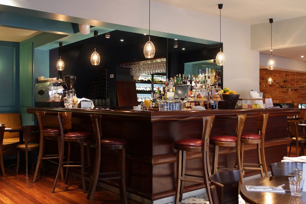
Portabello Restaurant and Bar on South Parade in Oxford's Summertown.

We were asked to assist with refurbishing this extremely popular premises, working with the owner to develop his aesthetic vision for the transformation, we provided design advice and working solutions throughout the process. The turnaround refit was 12 days in total which was achieved for a re-launch just before Christmas.

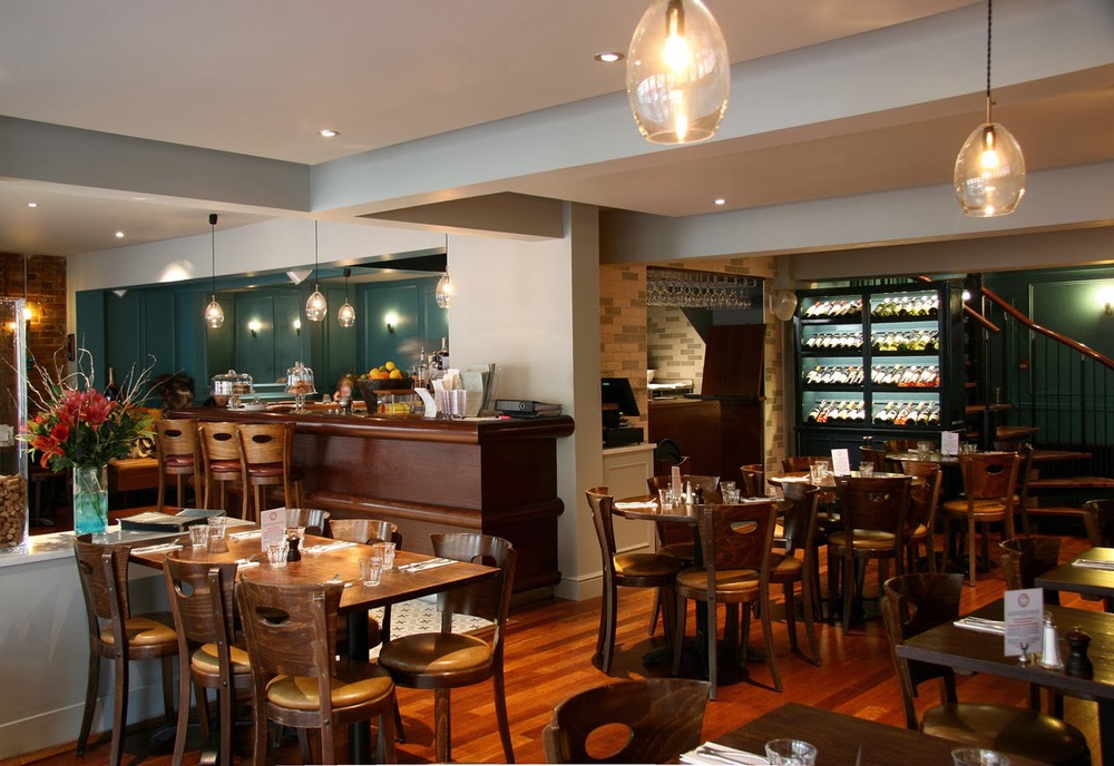
The general concept was to marry elements of Victorian charm and contemporary Soho house chic to give a warm, harmonised functional and aesthetic space, close, expansive, crisp and bright, and create a space to reflect their reputation for quality, providing a fitting backdrop for their renowned menu.
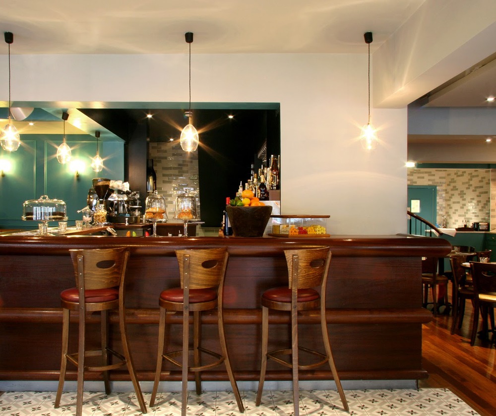


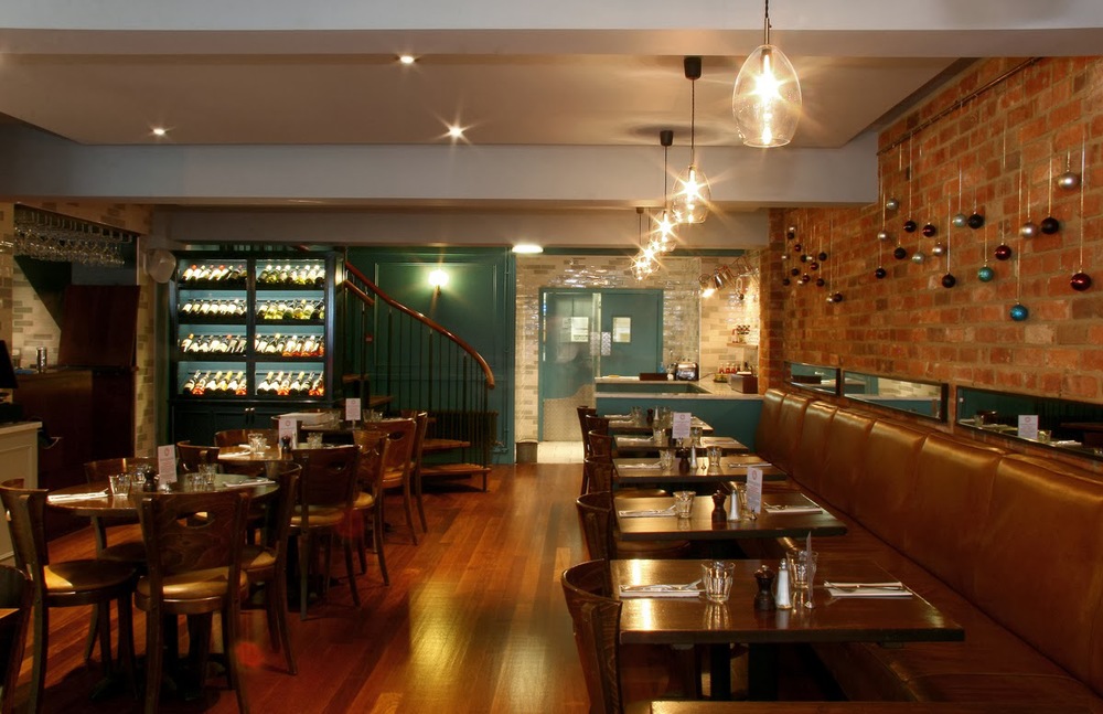
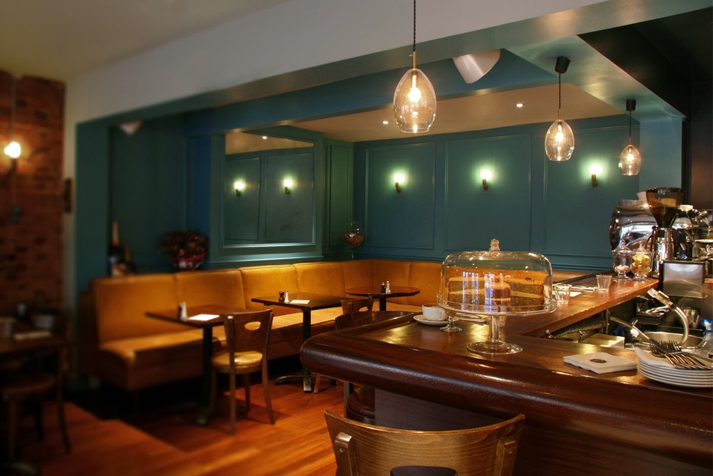
Particular attention was drawn to the need for less intrusive lighting whilst promoting a real sparkle. Ceiling spotlights were inset to help reduce glare and all lighting was placed on dimmers. The pendent lighting which we used as a subtle signature piece we dotted around the bar and over the seating to the right of the bar are from Northern lighting based in Sweden.

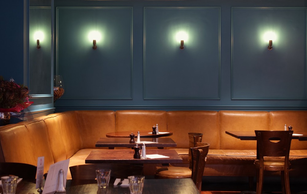
Beautiful cast bronze wall lights with an innovative cold cathode Carat squirrel cage bulbs (a breakthrough invention as alternative to the traditional energy inefficient incandescent version) are by renowned Belgian lighting company Tekna.

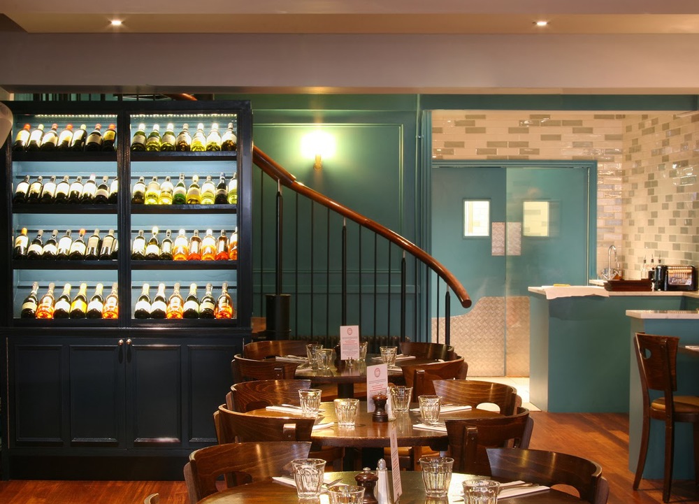
The entrance welcomes with its victorian patterned tiles which make an immediate statement - creates a greater sense of space and has attitude. At the entrance we also included lots of antique mirror work vertical and horizontal with borders of moulding, and moulded panel work used repeatedly throughout to add texture and a version of gentleman's club warmth. This can be seen quite clearly in the inky green snug area to the left of the bar. 
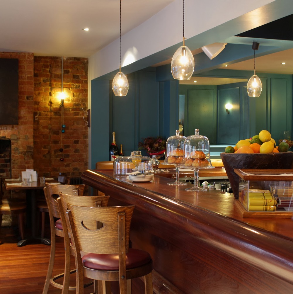

As the space when you enter seems to divide into halves we intentionally made the decision to work with some of the through bar views and using mirror where necessary to give reflection of other spaces and angles that gives a better and useful sense of wholeness. 
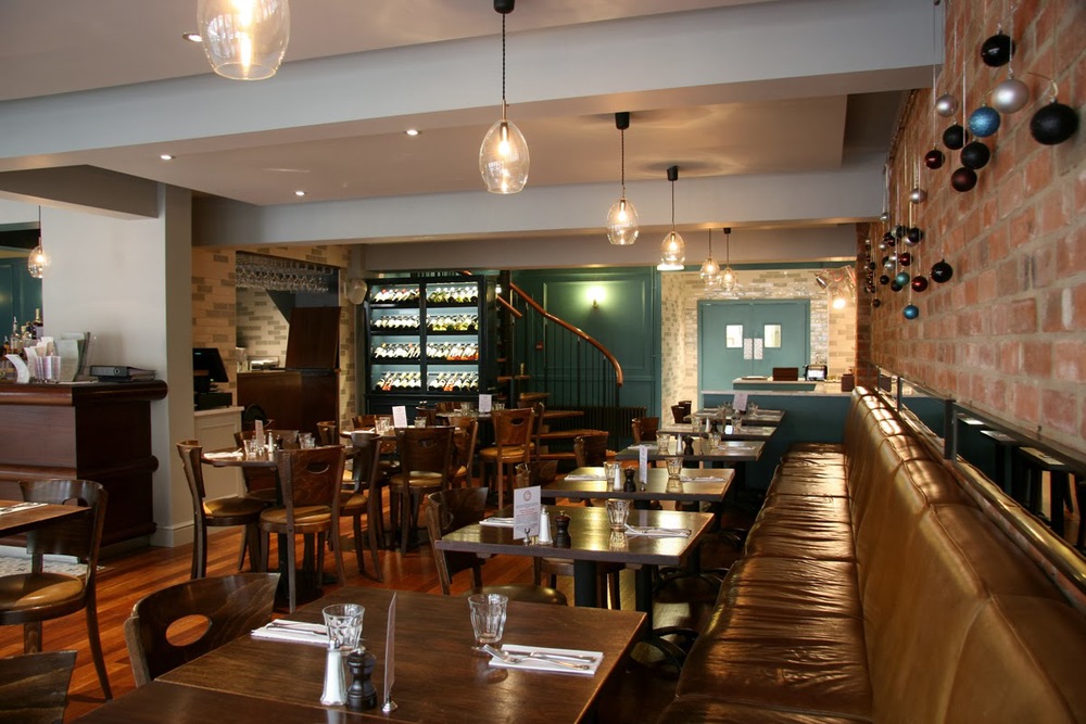


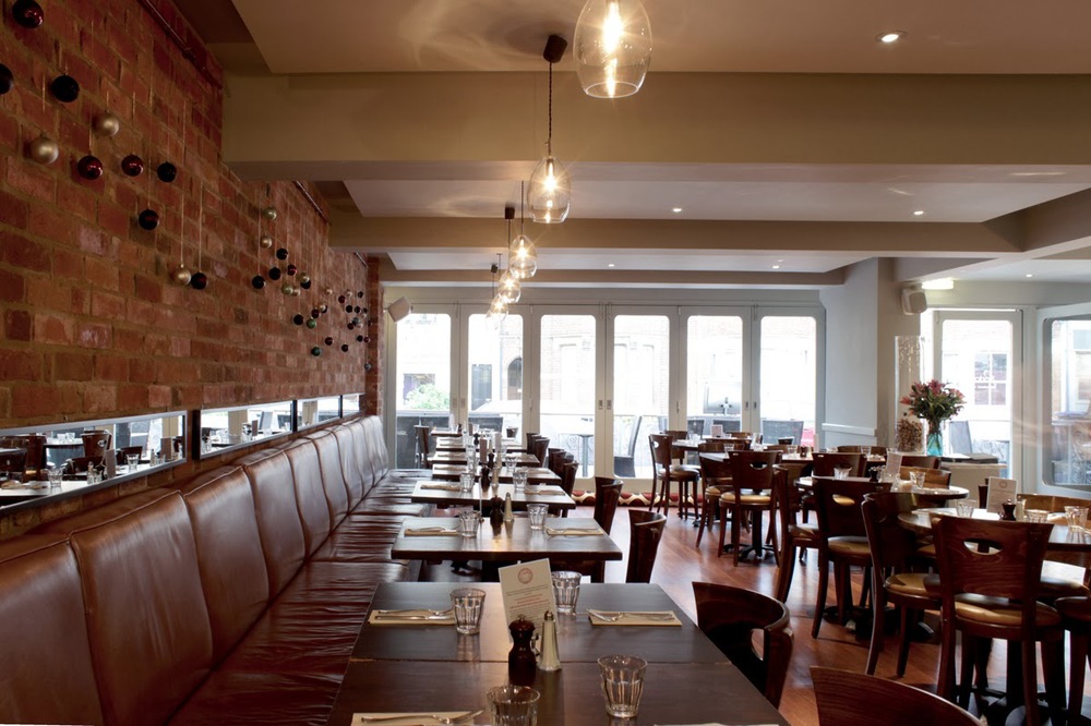
The tanned, distressed leather banquet seating was existing and became a strong
player in the colour dynamics of the space. The rich blue green holds its own and relates the strong victorian aesthetic element perfectly. 


The beautiful blown glass pendents travel down the line of the banquet seating. Close to the bar we designed and produced a wine storage/display cabinet painted in a very dark blue with integrated LED lighting that highlights the space with a level of sweet shop visual treat.


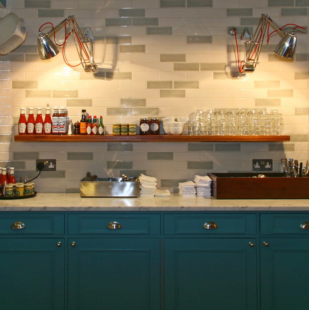
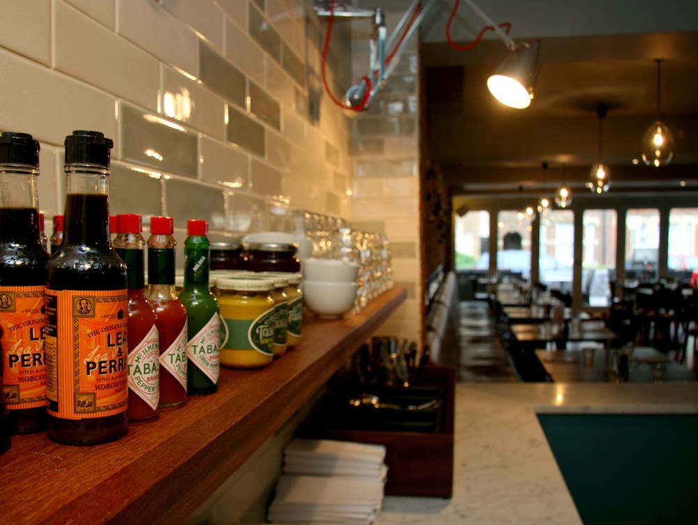
A waiter and serving station was created in panelled woodwork with Carrara marble, which made the link between guest and food deliberately close. Clean white marble tops and a mosaiced pattern slip glazed metro tiles to the wall, add a playful charm. They also highlight the scale of the room, bringing the front and rear into view at the same time and giving each of these spaces equal status.


This project was an absolutely pleasure to work on, and has been a hit - with even the restaurant's most loyal regulars. For more details about Portabello, visit their website here 

Portabello


a north oxford house

Drawing room and dining room >

In this drawing room (a proper, first floor affair) light and the huge windows are all. We wanted to create a design that played with formal traditional drawing room style, and messed about with it, adding colour and fun. A huge element of the room is the floor to ceiling shelving structure, which is constructed from ash with an ebonised hardwood that delineates and configures the structure. This was designed to house various elements including books, objects, TV and media and a stereo with space for cd's. This was a one-off item which we created for the client. It holds your attention and commands the space that it lies in. There is an almost art deco feel to it, with the dark and light woods and polished finish.

detail of shelving

The sofas were sourced from Fran at Liscious Interiors, and re-upholstered in striking fabrics in soft brushes cotton. The colours reflected the dining space but lifted and lightened. The Chesterfield grey sofa has a purple running through it and we applied very bright violet buttons to the piece and dressed with lime accents. The lime - or chartreuse - Chesterfield was very simply dressed and as such we reversed the colour works and had predominantly purple striped cushions in a deep velvet. 

A small day bed wrapped in a defined purple inhabits a space close to the book shelves and near to the distinctive sash windows.

A  balance between privacy and letting the light through was achieved by way of full length linen curtains with a silk floral motif running through, and a sheer roman blind that drops down (colourfully) to frost out the background, again in natural linen but with colourful stripes.

We strongly felt that this huge space did not need a central ceiling light, but to light the space with

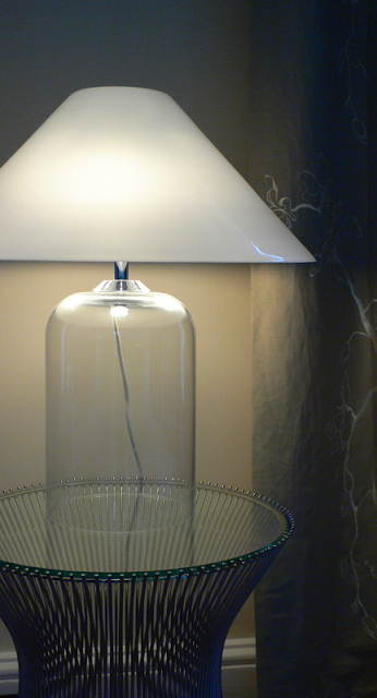
soft accent lighting at lower level would create better intimacy and harmony in an evening. The Alega glass table lamps (designed by

Vico Magistretti

in 1970) sits on Platner side tables, each a stainless steel spoke framework with a glass top created by

Warren Platne

r for Knoll in the 1960's. 

Platner side table with Alega lamp

The beautiful carrera marble fireplace is a focal point, its gas fire supplementing the classicv column radiators (in anthracite) we put in, and the alcoves either side are wallpapered with a fantastic

Jocelyn Warner

design. Period chairs were limed and re-upholstered in a funky silk, and an

Elizabeth Blackadder

piece catches the eye above the fire.

Dining Space >

glass table reflecting the window

Previous to its present incarnation, this was a jumbled space, cold and dark and possibly with mixed use. In its present form we decided to change shape a little. Keeping the 'hand made element' we made something a little more formal i.e  an evening dining space for guests.

Our client wanted a dark, intimate and rich palette, but with linking colour from the drawing room next door. Assisted by our client the colour we chose was a plum colour, in a proper flat matte, not cold. It sits more in the red spectrum. This gives it a deep lushness that with the addition of evening candle light, brings in a grandiose quality.

Add caption

Of the candelabra; it is hand crafted by French makers

Benoit Vieubled

and acquired through

Cameron Peters Fine Lighting

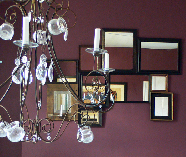
. Its artisan qualities shine out. Made from brass and copper and french glass yoghurt jars and crystals. It was further modified by myself with deft assistance by the owner, converting it from electrical to hold candles. Furthermore, it hangs by sash cord which is fixed via a pulley system and tied off near the dumb waiter. This allows the piece to be raised and lowered when necessary. Secondary lighting is via the picture lights overhanging the inherited pieces of our client.

On first entering the room from the hallway it becomes obvious that the dumb waiter is no longer functioning. Due to modifications in the past it had become a non viable restoration project. This left us with the awkward shape in the corner! As the owner wished to house some of his wine collection we decided that the best purpose of the woodwork was to turn it into a wine rack. I think this works especially well and looks rather neat and perfect as well as being architectural and fun.

wine storage

The carrera marble fireplace needed extensive cleaning to the marble to bring it up to a gleam. The hearth was simply of limed concrete and as such was painted black. A writing bureau, hand painted by Maitre Allegre now sits in the alcove closest to the window.

A collage of mirrors that we collected from a host of places hang in a pattern above the fireplace.

detail of candelabra with mirrors behind

Under foot, the carpet is a fine boucle in a light grey that adds a level of luxury to the rooms. It runs through the dining and lounge space and spills on through the hallway and staircase.

Below is a picture of the hallway with the dining space chimney wall framed in the antique mirror.

victorian terrace: funky lounge and a dj room


walnut alcove shelving and cast concrete fireplace
Yr: 2003+/-

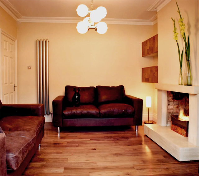
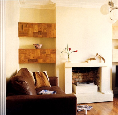
The lounge that was created, presented a warm front that included the brown tan leather sofas and one-off walnut alcove units that flanked the chimney breast. There was also a cvo firevault fire.
The fireplace as part of the one-off aspect that we like to throw into our projects was designed and created by rogue-designs.  It's made from concrete, parts of which were cast in-situ. It appears to float due to the shadow detail that we applied to it.

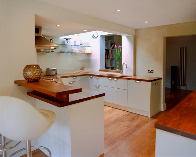
The walnut floor is a feature to the whole of the ground floor - approximately 96sqm. 

The vintage lighting again, was sourced through a supplier in London. 

The image above the fireplace was from a collage that i made and had blown up onto a foam panel. 


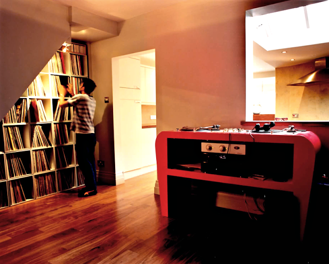
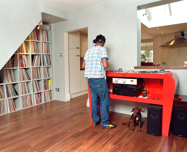
The space known as the DJ room, is situated between the kitchen and the lounge. The room housed the owners record collection. A functioning glitter ball was also attached to the ceiling. A discreet spotlight activated the spinning ball when switched on.  

No speaker cable was visible due in part to it all being housed behind the skirting boards. speaker points were then dotted around for increased flexibility. 

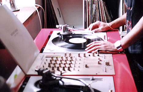
The dj console was created by rogue-designs, especially to house the dj decks with a space under for other electronic equipment. It was sprayed in a gloss lipstick red. As it was a feature to the space it warranted a stand alone quality.


bespoke dj deck